I just finished a photography book from my recent trip to Italy – a collection of about 230 images, and as many pages, distilled from the 4000+ photos I took. It reinforced in my mind something I already knew – that I really enjoy putting books together. But what is it about books rather than individual images that I find appealing?
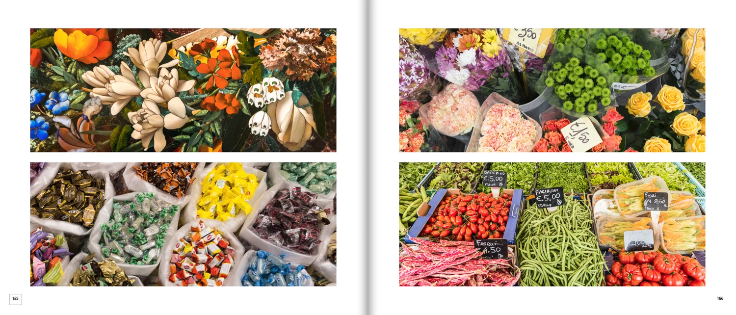
First of all, a book is not a collection of individual images, but of two page spreads. The left and right pages are viewed together and offer an opportunity to express something more than the individual images that are contained. I usually try to unite the images either thematically or visually through the shapes, colors, subjects or ideas they contain. This is not always possible, but it is so rewarding when it comes off. Images can also be selected to highlight the irony or humor in a situation, or maybe just because they look good together.
There are many occasions when I will include a photo that I didn’t rate very highly initially, just because it seems to fit well into the spread, and it takes on a whole new life in that context. Also, pairing images may often highlight a shortcoming in one of them, and cause me to continue to edit and improve it. I am forever making small tweaks right up until the end, and I think I have ended up improving many images to create a more consistent level within a book.
Here are a few two page spreads from my Italy book – not the best individual images, but ones where I think the combination is better than the individual parts.
The images in a book are also presented in a certain sequence that the reader is encouraged to follow. This can bring some order or flow to a diverse collection of photographs and make them more accessible and less haphazard to navigate. This was definitely a consideration when assembling the Italy photos.
Size is important and bigger is not necessarily better. Not all photos deserve to be the same size. A simple photo could look perfect as a small accent on a title page, but very weak as a full-page image. A vast panorama may look great as a full bleed (no margins) on a two page spread, but a delicate artistic detail may look best as a smaller image with a wide border. These options are lost when images end up in an online gallery.
Working within the layout of the page sometimes creates shape constraints that provide an additional challenge. However, this also can offer a new perspective on an existing photo and has often caused me to see an image in a totally new light. I have frequently ended up preferring the crop that I made to fit into a particular layout over the one I had in mind when I took the shot.
Finally, creating a book provides a whole other series of creative decisions related to graphic design, such as the layout, font selection, cover design, etc. I enjoy photography for the creative opportunities it provides, and this experience is prolonged and enhanced by continuing to work on the book long after the original photos were taken.
Most of the characteristics of a “book” endure even if it is viewed online, rather than as a physical object, although there is something special about holding the actual book, and turning the pages. The preview mode of the print on demand publisher I use (Blurb) even has a shadow down the center spine and realistically turning pages to try to mimic the real thing, and depending on the size and quality of your screen the experience can be excellent.


